
NVIDIA’s rise over the past five years has been one of the great growth stories in market history. From a graphics chip maker best known for gaming GPUs, the company became the indispensable supplier of the picks and shovels for the AI boom — its data center GPUs (the A100, H100, and now Blackwell architecture) became the default hardware for training and running large language models. Revenue and earnings exploded as every major cloud provider and AI lab raced to secure supply, and the stock rose from single digits to well over $200 a share, making NVIDIA one of the most valuable companies in the world. That success story is real and it explains why the stock has been such a market darling.
But a great growth story and a great entry point are two different things, and the chart tells a different story about how that story has been playing out over the last 18 months.
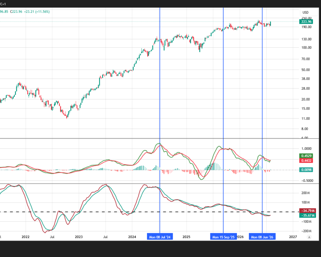
The two lower panels on this chart are the key. The MACD and the supply/demand indicator track the same underlying momentum, and when supply and demand are in balance, they move together almost identically. When they start to diverge, it’s a signal that the price move isn’t being confirmed by real participation — in other words, price is going up, but the underlying buying pressure isn’t there to support it.
Looking back to the first blue line in December 2024, that’s exactly what happened: the supply/demand line failed to cross its signal line even as price kept climbing. That was the first crack — a warning that demand was starting to thin out even while the stock pushed to new highs.
The second blue line, the rally into November 2025, is even more telling. Price reached a new high, but the rally showed weak demand and signs of distribution — meaning that as price rose, more shares were being sold into strength than accumulated, a classic Wyckoff distribution pattern. Smart money selling into a rising market while retail chases the high is a hallmark of a top forming, not a base being built.
Then the rally into April 2026 repeated the pattern — a price advance with very little real demand behind it. Three consecutive rallies, three consecutive failures of demand to confirm the move.
The cumulative effect shows up clearly on the supply/demand oscillator at the bottom: rather than being pulled higher by strong buying, it has been grinding below its zero line and trending down, even as price has continued to hold up near its highs. That’s a divergence that matters — price and the indicator disagreeing tells you the rally is running on fumes, not fresh demand.
Put simply, every leg higher over the past year and a half has come with progressively weaker participation. That’s not what healthy uptrends look like — it’s what distribution looks like. Great company, great products, but the chart is saying the buyers who drove NVIDIA to its highs have been quietly stepping aside, and there’s nothing in the current structure suggesting fresh demand is coming in to reverse that. Based on this, the risk here points meaningfully to the downside.